InfoSeeking, collect research data through game
Problem: Participants don’t feel engaged with the game or want to share it.
What I did: I research, design, and using content strategy to redesign the game.
Outcome: The work I did for the project saved at least 40 % of research time and support more than 80% of the incoming traffic.
About the project
Google or Not? is the game from InfoSeeking Lab. It is part of the research project, Fairness Accountability Transparency Ethics (FATE). The project's main objective to gather research data through participants’ answers on which search results are from google.
Executive interview
Getting scope and goals of the project
Collect data for research
People replay the game or share it on social media
People click play when seeing the post on social media
Self-Research and audit Key findings
More than 80% of traffic from social media is from mobile.
The game is hard to play especially on mobile. Users have to pinch to zoom to be able to play.
The game shared on social media is easy to miss as there aren’t any eye-catching elements.
game post on social media
The game on mobile view
User Interview and testing
Issues found
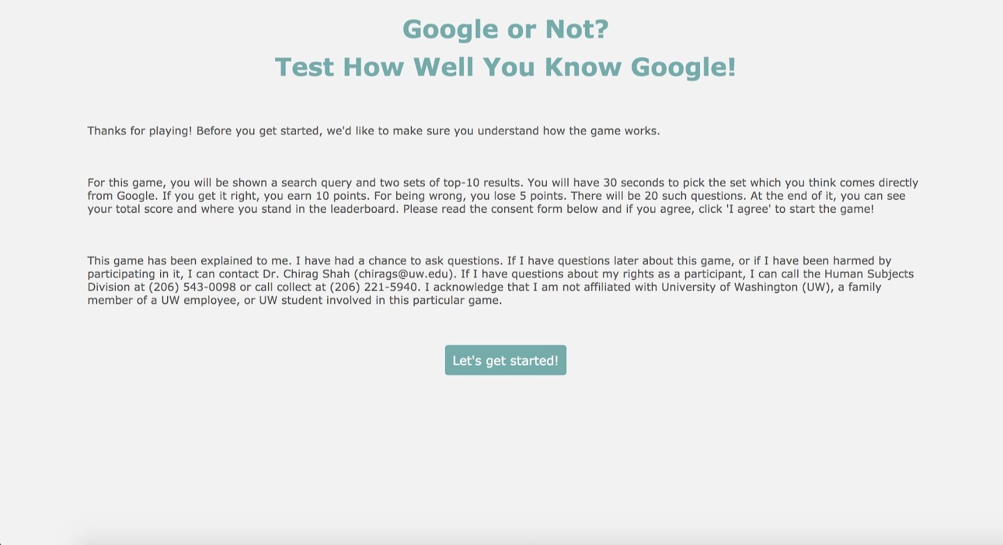
How to play page is hard to digest. The layout doesn’t support scanning and the text is small
Search terms are all jargon. For example “septic system design”. Participants don’t understand what they mean and don’t feel engaging.
The share button isn’t self-explanatory, and not dominant enough to encourage sharing.
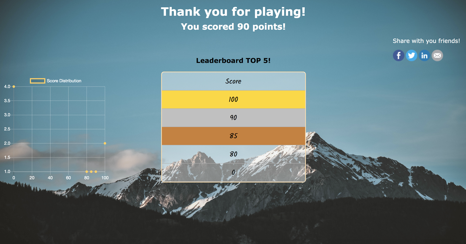
Score feedback page disappears is too fast and not support scanning.

Content & Design
1. I designed the mobile view of the game to support 80% of traffic from social media.
2. How to play page. Participants’ time is precious. We don’t want to waste their cognitive load in the long text. Make the page easy to scan and prominent call to action would help them move to the next step faster.
3. Game page. Stick the search timer and search term on the top of the page.
CS: Seeing the timer bar decreasing would make participants feel more engaged and focus on the game. Seeing the search term would help them play games easier. They can focus their working memory on the results set.
*constrain on this page is that the result set has to present side by side to get accurate research data.
4. Feedback.
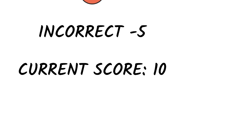
CS: Mapping content on the feedback page to help participants make meaning of the score. Adding a badge gives them the incentive to continue playing and tell them how far away to the next achievement entices them to go on.
The page is presented longer to allows users to comprehend the page.
5. Badge and text.
CS: writing to trigger emotion. Make participants want to share and replay. Instead of the raw score, mapping content by using percentile and badge to help them make more sense of the content.
Copy and Design of each badge
Google Conqueror!
Your eyes can peer through Google AI. It is hard to find others like you.
You almost beat Google!
Great vision my fellow owls. Keep it going.
Not bad for Google’s prey!
You have average eyes and got deceive as much as others do.
You are blind as a bat!
We know vision isn’t your strong suit. Get some training and come back.
Google knocked you down!
It’s alright little friend, Go get some glasses and try again.
6. Leaderboard
CS: Let participants left their mark once they made it to our top 5. Humans are obsessed with the concept of me, me, and I. By allowing a certain group of people to leave marks act as an incentive and rise competition at the same time.
CS: Left some mockup users on the board to encourage engagement. It also plays on social contagion as people want to do what the majority of people are doing. By leaving it blank, participants might perceive the game as unpopular.
7. Image for Social media share. Post that has an image can grab people's attention better than one that doesn’t. It can increase engagement by up to 50%.
Metrics
These are some metrics that I recommend us to measure to evaluate this recommendation and use to improve in the next version.
Usability test to measure user’s game comprehension, likeliness to share, and replay.
The number of participants drops out from each step in the flow.
The number of participants from mobile and desktop.
Outcome
The game could be better; however, from evaluating between resources and the outcome that we could gain, we decided to stick with this suggested version as it was enough to gather the data for the research project, i.e. FATE.
The work I did for the project saved at least 40 % of research time and support more than 80% of the incoming traffic.
My takeaways
Many usability issues can be flagged prior to user testing; However, user testing can be used to prove the hypothesis proposed and convinced stakeholders.
Evaluation between resources and outcomes that match the organization - in this case, the lab - is important to grow as a whole team. I should look for the most efficient solution, most impactful while using the least resource.
If I would do it again
The project was handed to me at the end of the stage and had limited time and resources for improvement. If I was involved in the project earlier, I would help plan and give suggestions to set the project for success.
Design a different badge style. With limited time, I went with the idea that came first. I would research more for the style that harmonizes with the overall game theme.


