BUILDING COMMUNITY THROUGH EASY-TO-USE SCHOOL REPAIR REQUEST SYSTEM
2020, Google Design challenge: Report repair system (For students & staffs)

Problem:
Students: They don’t care to report the issue. They don’t trust that the sent request would reach someone. Filling the report form also feeling like a task.
Coordinators: Information from report forms is ambiguous. They can’t tell exactly what and how important issues are.
Mechanic: Don’t have enough information to start their job. They have to waste time in the fieldwork once they found they came unprepared.
Goal/ What I did: A new report system that is easy to use, community-oriented, and encourages an appreciation for all roles.
Process
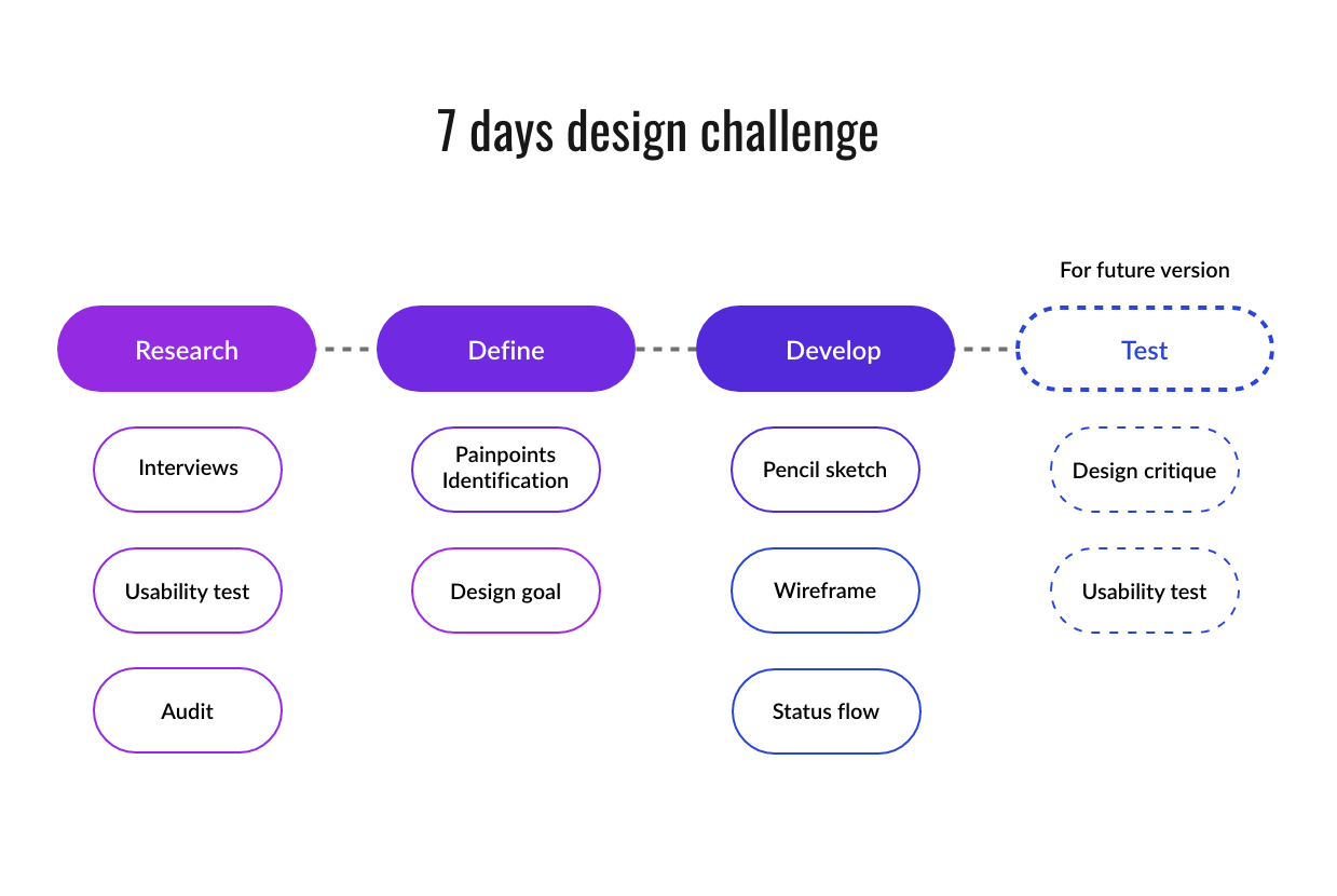
User interviews (Students)
Students don’t know about the current system. They don’t care to research to report.
“If the chair is broken, I can just find another chair.” - said the studentStudents would consider reporting the issue if the problem affects them daily.
“I would do it if the problem is big enough”- said the student
Usability test (Current system)
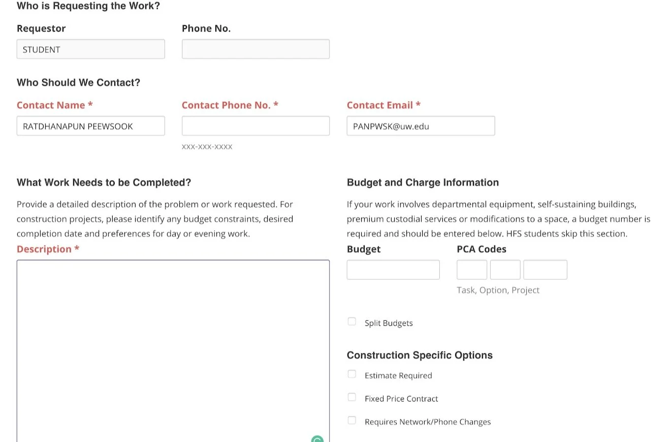
The form asks for unrelated information.
Students don’t know what to put in the “Budget” or “PCA Codes”.
Using the service is not delightful
“This feel like a task” - said the studentArticulate the story took a lot of effort as the form relies heavily on text description.
“Too much typing”- said the studentStudents don’t trust that the request they sent would reach someone.
“Submitting to a computer doesn’t do a thing”- said the student

Current System Audit (getting insight on Staff side)
Multiple work status reflects different departments working together to get work done.
*With limited time and no connection to any of the staff, I’m going to scope down into 2 roles, the coordinators and the mechanic, to show the workflow between departments.

2. There are many unclear requests. The staffs have to rely on two sentences of description to continue to the next process.
3. The form doesn’t support facilities that are outside the building. The only indication that they can rely on is the work’s description.
Design Goal
After all the findings in the research, I want to create a new system that is
Easier to use for all roles. Users could use the system faster and don’t need to go through ambiguous information.
Encourage appreciation. Students and staff feel good when help taking care of UW facilities.
Community-oriented. One of the main problems is feedback. By making the new system community-oriented, everyone can give feedback easily, both students and staffs.
IdeaTion
For an easier understanding and design, I will use these 3 characters to tell the story


Sketches

I sketched to explore visually how the system could look like. I choose mobile applications because
Students can conveniently receive updates and come back to their requests.
Convenient for staffs to access regularly and easy to carry around when going on fieldwork.
status flow
I created the status flow to show the actions and work status each role will go through.

Wireframe
With ideas I explored in the sketch and the flow, I moved on to create the wireframe of the system.
How it works (Student side)

Login page
Since it is a UW system, Login in with UW NetID is required (All UW students, staff, and faculties would have this account ).
List page (Student view)
Once finished login, students can see all requests and its upvote number. They can search, filter by request’s date, status, and building. They can also sort by upvote and newest.
Map page (Student view)
Map view allows students to see where on the campus requests are submitted with its upvote number.
From the list page or map page, Kate can tap on the “Request Repair” button to start the requesting process.

Request page
Kate then chooses the location where the repair is needed then tap the “Request repair here” button which will send her to the Request from.
Request form
In the “Request From”, Kate can add photos to clearly identify what is broken.
Locations and photos allow Kate to articulate the issue without having to write a lot of information. Sarah and Bob get more quality data which allow the to easily move forward with their task.
Contact info page
In the “Contact information”, Kate can choose to receive updates on the request she is filing. This feature assures Kate that the request will be seen.

Appreciation after sending the request
After Kate sent the request, she will see this appreciation message.
This page act as an incentive. By phrasing that for caring in the UW community, students feel good and want to request more repair when they encounter something broken.
Furthermore, the message reassures student again that the message was sent to the team

Kate and other students upvote, comment, and share the request
This feature serves the community-oriented goal. It helps
Sarah determines urgent requests.
Bob knows that there are people who need his work.
Kate also sees that there are people who experience the same issues and receive incentives from upvote comments and share.
The share feature allows more traffic to the app.
Sarah - Accept work, fill budget form, schedule repair

Sarah - List page and Work detail page
After the requests were filed, Sarah and other personnel can see them in their system. The requests that other personnel is responsible for will have the status “Taken”. Sarah can choose the “Accept” any work with the status “Empty”.
Sarah- Analysis form
After tapping accepted, the budget analysis form will popup. Sarah can choose to fill the form now or edit it later

Schedule page
After Sarah has done filling the form, see can “Schedule Repair”. She can review the budget information, choose the date and departments before sending the work to the responsible departments.
* I designed to have only one main action in each work state for each role. Therefore, it is the call to action on the page.

Bob - Work report page
Bob accepts work in the same manner as Sarah. However, Bob only sees the works sent from coordinators. Once he accepted work, the work report form popped up. He can choose to fill it now or edit it later.
Bob - complete work
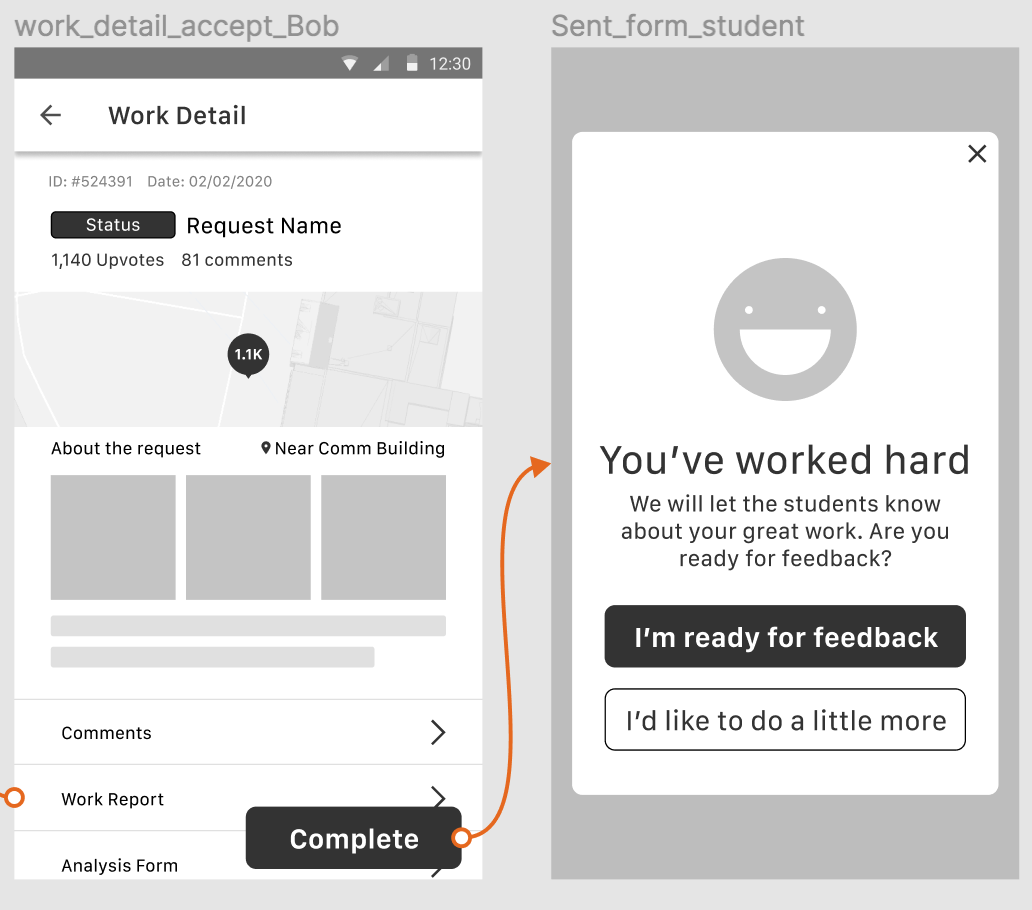
Once Bob finished the work and done editing the report form he can then tap “Complete” to finish the job. I designed the wording to increases the stakes and let Bob think twice before completing the work and also give some incentive to Bob telling him that he has worked hard.
Students - give feedback
After Bob completed the work, students are allowed to give feedback.

Smiley face
I designed the message to act as an incentive for students. By showing the name of people in the team, make the experience more person to person not a person to a computer.
Sad face
I designed the message to make the students think twice. By asking students to suggest improvements make it harder to send negative feedback and keep the community positive.
This serves the encourage appreciation goal, helps Bob and Sarah acknowledge the importance of their work.
Notifications Features

Notifications nudge them to come back to the app and continuously let them know that their works/requests are wanted and have value. Therefore, what they are doing in the app also has value and contributes to the community.
This is the whole flow:
https://drive.google.com/file/d/1fA3PFf52Bt6qQ28FfLGYBf-pyXhdglc1/view?usp=sharing
If there are future versions
I would conduct more user tests to validate
Users’ comprehension of the process - students, coordinators, and mechanics.
Students’ trust in the new system whether they feel like the report the filed goes to the real person.
Efficiency and emotional value of the upvote, feedback features, map location, and issues image for staff.
If I would do it again
Conduct a comparative analysis of other services providing the same feature. This will give some ideas of the things others have done that works (or doesn’t work)
Do deeper research on how the issue flows between departments.
Other projects