A Fitness App That Enhances Motivation
by Providing the 'What' and 'Why' Behind Workouts
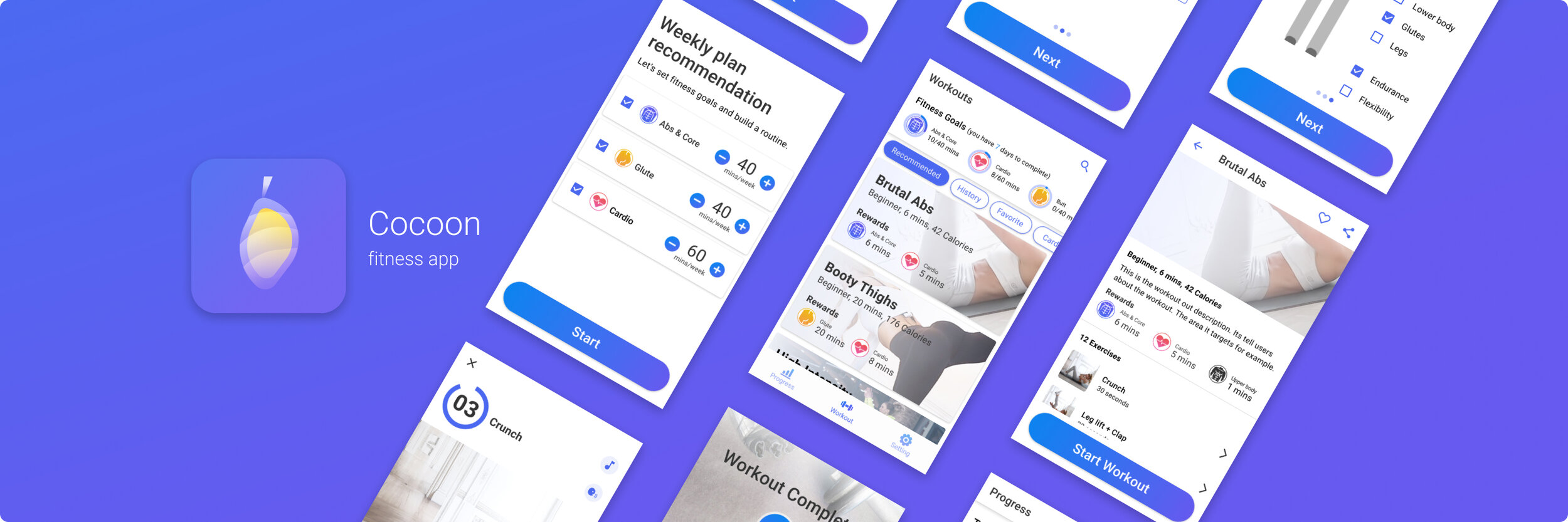
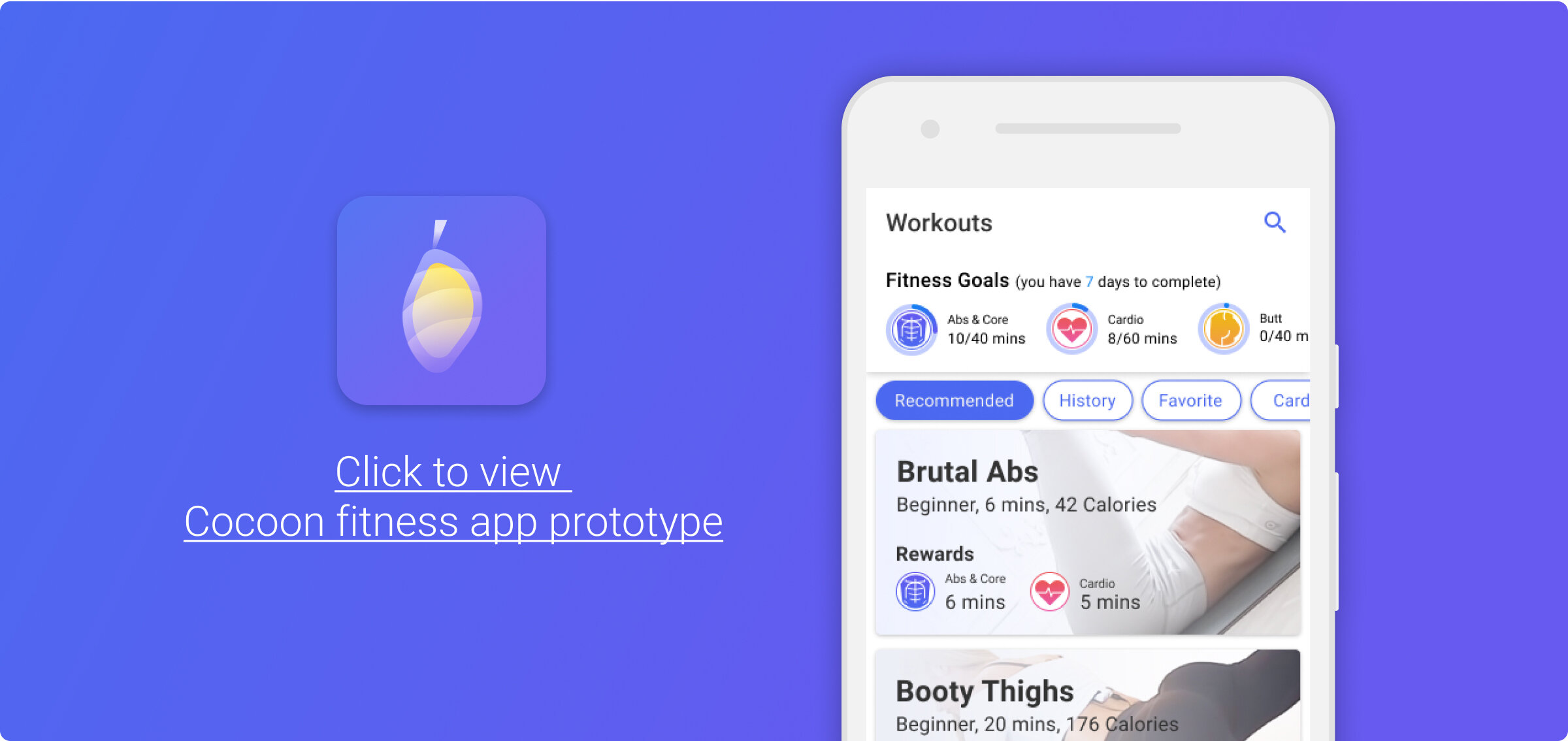
2020, UX case study: Cocoon fitness app
This project is listed in The Best Workout App Designs by DesignRush
Problem: People who are trying to develop an exercise routine don’t feel motivated to keep on with their routine.
What I did: I designed a fitness application that breaks up their routine into weekly goals that represent ‘why’ they are working out.
Outcome: According to the usability tests, Participants said:
Displaying the goal helped keep them on track when choosing a workout (average score of 4 out of 5).
They said the app would help them create a workout routine (average of 4.3 out of 5)

Process

User Interviews Findings
I conducted 5 virtual interviews with participants between ages 21 to 40.
For people who had a regular exercise routine.
Challenges:
Closing down hinders their ability to be as active as their pre-COVID exercise habits.
They don’t want to risk getting the virus when going out to exercise.
Home exercise doesn’t satisfy their needs.
Need: They want an alternative exercise that gives them the same experience as their pre-COVID habit.
For People who are trying to establish an exercise routine.
Challenges:
They don’t have enough motivation to keep up with the routine.
They don’t want to risk getting the virus when going out to exercise.
Opportunity:
COVID-19 situation pushes them to start a regular exercise routine because they want to be healthier.
Achievements made them continue to exercise.
Need: An exercise routine that is fun and motivating.
Journey Map
I made a journey map to visualize the process the participants went through in terms of physical activity during the COVID-19 situation, their feelings and thoughts, and the key findings.

After learning about users, I chose to focus on solving the problem for people who are trying to establish exercise goals.
Comparative Analysis
Adidas Training by Runtastic
Workout for Women
MyFitnessPal
Planta

Common elements

Workouts cards consist of:
duration
name,
level
calories burned

2. The workout page consists of:
workout demonstration
moves name
countdown
routine duration
and control buttons
3. The exercise sounds while following the workout consists of:
voice guidance
prompt for the next move
background music
Elements that could improve
The tracking page only tells ‘what’ users have done but not ‘why’ they are doing it.
This is the gap I chose to explore further on my project

2. The workout browses page shows irrelevant exercise to my need even though I told about my focus when I first visited the app.
This is another opportunity gap that I chose to explore to differentiate my solution from others.

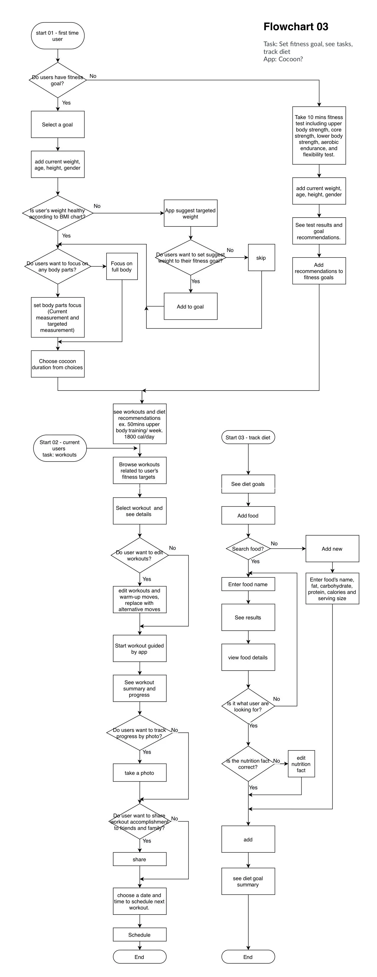
Flowchart
I created a flowchart to help me envision how a user would go through the process in my application.
Tool I used: Draw.io
Sketch
I sketched to explore how the process would play out visually.

Task page

Workout page

Progress page
Design critique feedback: Adopting both diet and fitness might confuse users and required more workload.
I decided to go forward with the fitness part of the idea because it is more direct to the user problem.
Wireframes
I narrowed down my decision into 2 sets of wireframes. I focused on the core pages to communicate the purpose, goal, and functionalities of my application.

Idea 01

Idea 02
Design critique feedback:
The word “Weekly goal” can be confusing as it is a goal that changes weekly.
Idea 02 of the workout page makes more sense as the related elements are closer to one another.
People took longer than I thought to make sense of the workout completed page.
There is a suggestion that I could have users edit what they want to see on the progress page. However, I want to test it with the prior knowledge that users set the goal and input measurements that they focus on to see if there is still the need.
Prototype and site map
I used the feedback to refine the design, created an interactive prototype, and site map

Prototype

Site Map
User Testing
5 participants.
Issues found
All of the participants didn’t notice the word “Weekly” on the “plan recommendation” page.
Solution: Adding “/week” after the “mins” recommended duration on each row could quickly solve this problem as the unit is the part that all the participants mentioned during the session.
Participant confuses between the timer of the move and the timer of the whole workout because:
The app never informs the user if the moves are counted by rep or by duration.
The visuals of the two timers are also too similar.
Solution: I would change the visual of the timer of the move to a circle around the number. I would also add the number of reps or the duration of time on the workout detail page to prime users ahead of time before they see the workout page.
Metrics
There aren’t other main problems with participants' comprehension of the overall application.

Participants rated usability score is 4.4 out of 5.
Participants said displaying the goal helped keep them on track when choosing a workout with an average score of 4 out of 5.
They said the preliminary questions offered by the app cover their fitness goal well with an average of 4.5 out of 5.
They said the app would help them create a workout routine with an average of 4.3 out of 5.
Final Design
To sum it up
People who are trying to establish an exercise routine want to be motivated and see achievements to keep up with working out. Therefore, I created a fitness application that provides goals-based workouts and progress tracking solutions. People can see exactly the workouts that match their goals and how far they are from achieving the goals. Unlike other fitness apps, it tells users not only ‘what’ but also ‘why’ they workout. According to the interviews and user testings, participants said the app would help keep them on track when choosing the exercise and would help them develop a workout routine based on their fitness goals.
My takeaways
No project will ever be perfect. There is always room to improve.
Know what to work on. Make the decision on what would make the most impact ( in this case solving user problems) while using the least resource (workload).
When lost in the process, look back to the user’s needs and pain points and analyze your choice based on the information.
If I would do it again
Plan more for the future version instead of MVP, minimum viable product. I would lay out the path from MVP, version 1,2.. to the optimal version. Due to the time limit, I had to cut down many features and focus on the main ones that would solve customer problems.
Research more on the theme of the application. One observation I had for this theme is it might be too calm. People would want to feel energetic and motivated when entering a fitness app. I would take more time to find out the data to confirm or decline this observation.
Other projects