UX research: Amazon’s Prime Wardrobe (version November 2019)


Goal: Evaluate Prime Wardrobe’s discoverability, comprehension, availability, and value compared to without using the prime wardrobe.
What I did: I conduct a research using Heuristic evaluation, Interview and Usability test.
Outcome: I found that people are unlikely to shop for apparels on amazon, recommend others, or user Prime wardrobe again
What is Prime Wardrobe
Amazon’s Prime Wardrobe is a service that allows customers to try on apparel before they decide whether or not to buy the items.
Process

Heuristic Evaluation’s findings
I user heuristic evaluation to uncover possible usability issues.
Situation awareness. Users might not notice that they are still inside or outside of Prime wardrobe service.
The product detail page inside and outside Prime Wardrobe is very similar.
Multiple links could lead user away from the service.

In Prime Wardrobe

Not in Prime Wardrobe

2. Availability. There is no direct way to get users back to the Prime Wardrobe service when they navigate back to continue shopping.
4. Missing steps. When users select the size that isn’t available in Prime wardrobe, the service cart button disappears. The site does not provide information about how to access the button or explain why the button doesn’t appear.

Usability Testing
Goal: Prove the issues pointed out in the heuristic evaluation.
Designing test tasks
Task 1: Looking for dress shoes on Amazon.com within a $75 budget limit
Starting at amazon.com home page, I asked our participants to look for dress shoes. This is the original path that any customer will have to pass in order to access the page that informs them about the Prime Wardrobe service.
Metrics
Ease of use (without Prime Wardrobe)
Product selection satisfaction (without Prime Wardrobe)
Prime Wardrobe Discoverability
Prime Wardrobe first impression
Task 2: Looking for dress shoes using the Prime Wardrobe service within a $75 budget limit.
Once they discover the Prime Wardrobe service, subjects were given the same task but this time using the service.
Metrics
Ease of use (with Prime Wardrobe)
Product selection satisfaction (with Prime Wardrobe)
Task 3: Looking for a second set of dress shoes using the Prime Wardrobe service within a $75 budget limit.
We added this task measure learnability of the service. Users should be able to complete the task faster the second time
Metrics
Ease of use (with Prime Wardrobe)
Questionnaire
After users finish all tasks, I asked questions to evaluate:
Perceived comprehension of the service.
Actual comprehension of the service.
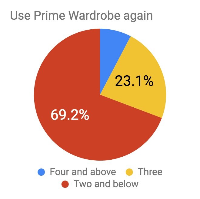
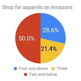
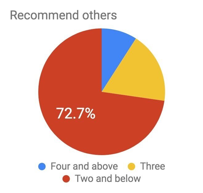
Likelihood to use Prime Wardrobe again, shop for apparel on amazon, and recommend friends or family
See full Usability Testing Script
Usability Test results (Quantitative)
with 13 participants I found:
Discoverability issue. 7 out of 10 participants didn’t mention Prime Wardrobe service when we asked “What strikes you?” on the product detail page.


2. Usability issue. The tasks are basically alike. However, the ease of use scores is dropping instead of increasing.
3. Comprehension issue. Participants rate their comprehension higher than their actual comprehension score. The average score of perception accuracy is 4.15 while the actual accuracy score is 3.

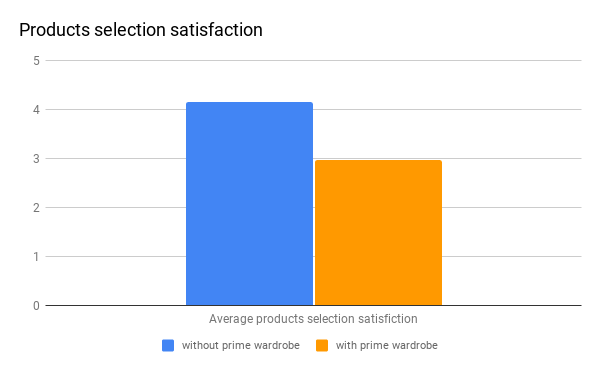
4. Product selection satisfaction score is decreased.
Product selection satisfaction before using Prime Wardrobe is 4.15 was dropped to 2.96 after using Prime wardrobe.
5. Value
From 5 being “very likely” and 1 being “not at all”, participants said there is a low likelihood to use the prime wardrobe, shop for apparels or recommend others.
6. Dropped in users’ enthusiasm.
Participants showed better enthusiasm when they first learned about the service compared to after they used the service.

What users said
“Prime already has free returns and we get the products faster. I would prefer to pay first than have to wait 7 days for items.”
“I don't want to be responsible for extra items or return them.”
“I can get what I want elsewhere easier and better pictures.”
“I usually buy 1 item at a time. I don't want to be forced to order more.”
“I enjoy shopping on Amazon without Prime Wardrobe.”
Usability Test results (Qualitative)
1. Users did not notice the text “To buy, select Size”. They end up clicking the ad to cart button multiple times before they realize whey they have to choose a size.

Solution: Display a popup when users click “Add to cart” button before choosing size.

2. Users said the information displayed is too clustered.
Solution: Eliminate unnecessary information.

Before

After rearrange elements
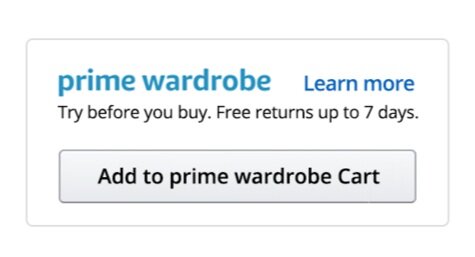
3. Participants confuse “Add to cart” button as adding to Prime Wardrobe cart because. They also confuse “Prime & Free return” as Prime Wardrobe. They are ready to check out thinking they are using Prime wardrobe service. This is because when a product isn’t available to Prime Wardrobe, the cart button just disappears.

Solution 1: Move Prime Wardrobe up to a more prominent location and keep it there even when the product us un available

Solution 2: Inform when a product is unavailable.
When available

When unavailable
Solution 3: Tell availability when select size or color.

Sizes that available in Prime wardrobe have a logo next to them.

Colors that available in Prime wardrobe have a logo next to them.
3. Confusion of cart button
Participants clicked the usual cart button to access the Prime Wardrobe cart page. They didn’t notice the “Prime Wardrobe cart” button
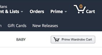
Solution: Merge cart. Users can click directly on the icon which takes them to the Cart page, displaying both “Shopping Cart” and “Prime Wardrobe Cart”, or, clicking the dropdown menu allows the user to choose the cart they desire.

The old cart icon doesn’t show the number of products in the Prime Wardrobe Cart.

Suggested new cart icon

Show dropdown
If there is a future version
I would conduct another round of the same usability test to evaluate if the changes solve the issues.
My take aways
Heuristic evaluation helps get insight when designing the test plan that would uncover the issue.
Scripts play a crucial roles in keeping usability test consistency.
Quantitative data can be gather through usability test as well.
Discoverability, comprehension, usability, satisfaction, and value are 5 important aspect to evaluate a product.
Other Projects