
Applying working memory with UX design, and Airbnb

Blog by Pan Ratdhanapun Peewsook, May 02, 2020
Have you ever called your bank, internet, or mobile phone service provider and have to listen to all their auto-response choices in order to figure out the right one for your next step? By the time you listened to your 5th choice, you have forgotten other prior choices. Then you have to dial them again listening to all the choices from the start.
What should we know about Working Memory
This is because of the limited space in your brain, i.e. ‘ Working Memory’. Working Memory is where we process the information needed to accomplish tasks. We can only hold about seven digits, or six letters, or four to five words in our Working Memory. If the information is larger than our limited space, it will either slip through or displace the current one in the space. Moreover, the information in Working Memory is short-term and will decay in about 30 seconds.
Daily life example
To give some more of our daily life example, when we type someone’s phone number into our contact. We need to look back and forth to the number we noted or from a name card several times. This is because out Working Memory can hold only seven digits at a time.
As designers, We should use this knowledge to reduce unnecessary cognitive load due to limited Working Memory space and offer our customers better services.
Voice auto-response example
Cycling back to our voice auto-response choices at the beginning, applying the knowledge of limited space in our Working Memory, the choice architecture would give about 4 choices to users at a time, content strategist would keep each choice simple and easy, I would say 1-2 words, and the record reading those 4 choices should be within 30 seconds. Note that those numbers are the maximum capacity. Exhausted, going through long day users would have a lesser capacity.
Using Working Memory in COVID-19 situation
During this hard time, many business owners are focusing their strategy on online selling, shifting to delivery, and take out. Many updates their website, adding phone number and address on their home page. However, they forget to make them clickable. This information again doesn’t fit in our working memory. Your prospective customers came to your website and got interested in your product or services. They might want to call you to order or check how to go from their place to yours. By not having those items linked, you are troubling your prospective customers by having them pinching their phone try to copy, or look back and forth from your website and another application inputting number and address to reach you. What if they mistype one letter or get too frustrated? The prospective customer got a bad experience and give up on trying out your products or service.
The solution is easy. Just link your number and address to a map application. If you use a third-party service to deliver your products, link those to your website as well. You don’t want to have them search you on those services and get distracted by other things offered in there.
Here are ways you can link your number. ‘How to Create a Click to Call Link Using HTML and in WordPress’
Here are ways you can link your address, ‘Link the business address on your website to a Google Map’
Below is a more in-depth example of applying working memory. If you are learning about UX or just have time and want to know more, read on!
Applying working memory with Airbnb’s place detail page
This issue
Most customers who reserve a place through Airbnb are going to the country for the first time. They have no idea about the area, the transportations, or even the language.

Though Airbnb offers some information on the attractions and public transports close to the place, users still need more information to make decisions. For instance, users might want to know if there are any close by convenience stores, currency exchange places, wanting to know the distance from the place to their planned destinations. They would have to go to other map applications.
However, to remember a street name, often in foreign languages, and search it in other maps applications is quite a challenge. The name wouldn’t fit in our Working Memory space. As a result, our customers have to go back and forth between our website and other map applications, typing the street name and hope for the right result or trying to zoom in and out to figure out where should the place located in the other map. Either way, it could make our customers become frustrated
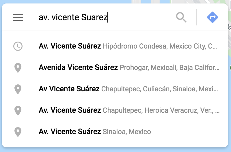
Search result of street name on Google map.
Recommendation
Adding features to display more relevant information on the map in Airbnb’s place detail page would be the best solution but it takes time and resources. Therefore, I suggest these solutions
Add “Open in [other] map” button.
Airbnb could add buttons to send our customers to those famous map applications with the location of the place so they can look for the information they need without having to struggleAllow coping latitude, longitude to clipboard. Every place is attached with its own latitude and longitude. To cover all the map applications that our customers might be using, we could allow copying latitude, longitude to the clipboard so that our customers can easily paste them in their desire map applications.
Note: if the owner doesn’t provide the exact location before booking, providing an estimated latitude and longitude is still better than nothing.
Metrics for Recommendation
For the first recommendation, we could conduct usability testing before and after improvement. In both testings, we should measure
Time customers take to decide whether they would pursue to reserve the place or not - if the time they use is decreasing this could mean they can get to the information they want faster
Customers rate ease of use score after they make the decision - if they rate the ease of use score after improvement is higher, this would mean the “Open in [other] map” buttons help them navigate to the information necessary for making the decision.
Customer rate satisfaction on information provided that related to the place - if the score increased, they are more satisfied with the improvement.
Reference
Evans, D. C. (2017). Bottlenecks: aligning UX design with user psychology. Apress.